Novalternativa- Logo, Identity Design
Brand
Novalternativa
Category
Construction
Year
2019
Team
Mateus Alves
Michael Hinds
The challenge
Our resolution
We designed a modern and approachable logo that captures the essence of Novalternativa’s commitment to affordable housing. Using clean lines and a solid, trustworthy icon, we created a visual identity that reflects the company’s dedication to providing high-quality, accessible homes. The design communicates Novalternativa’s core values of innovation, safety, and sustainability, resonating with their target audience and reinforcing their role in improving housing solutions across Brazil.
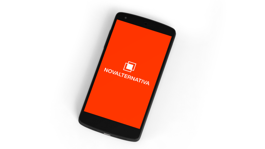
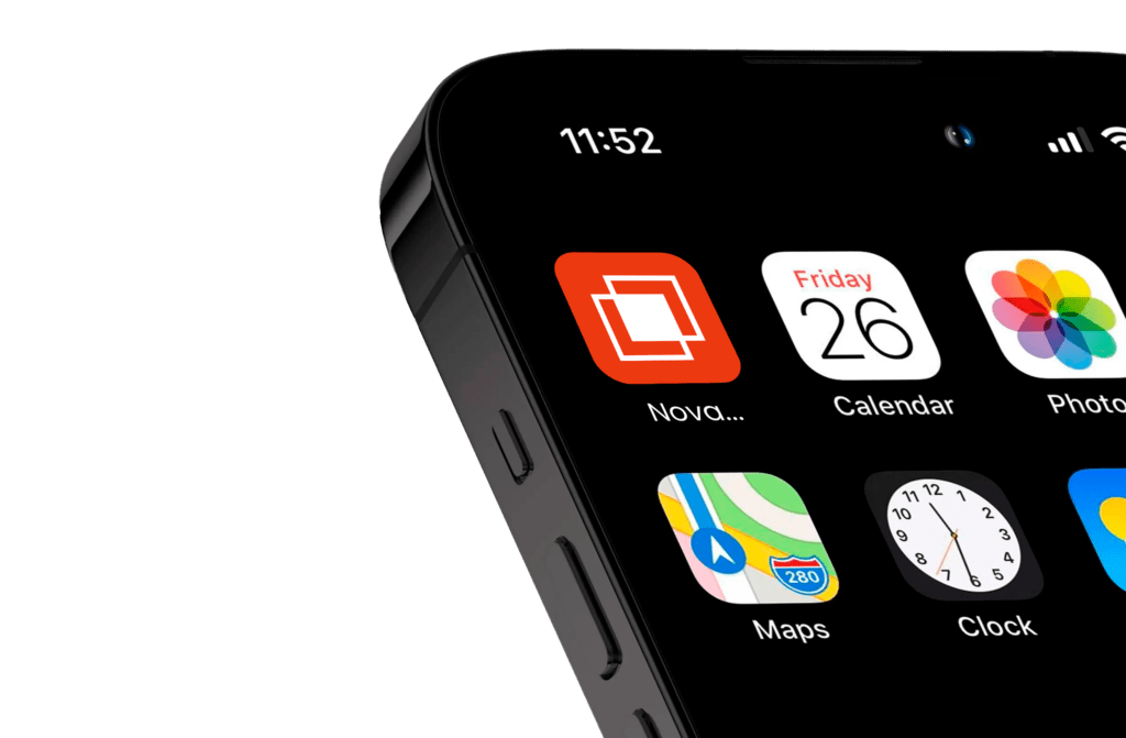
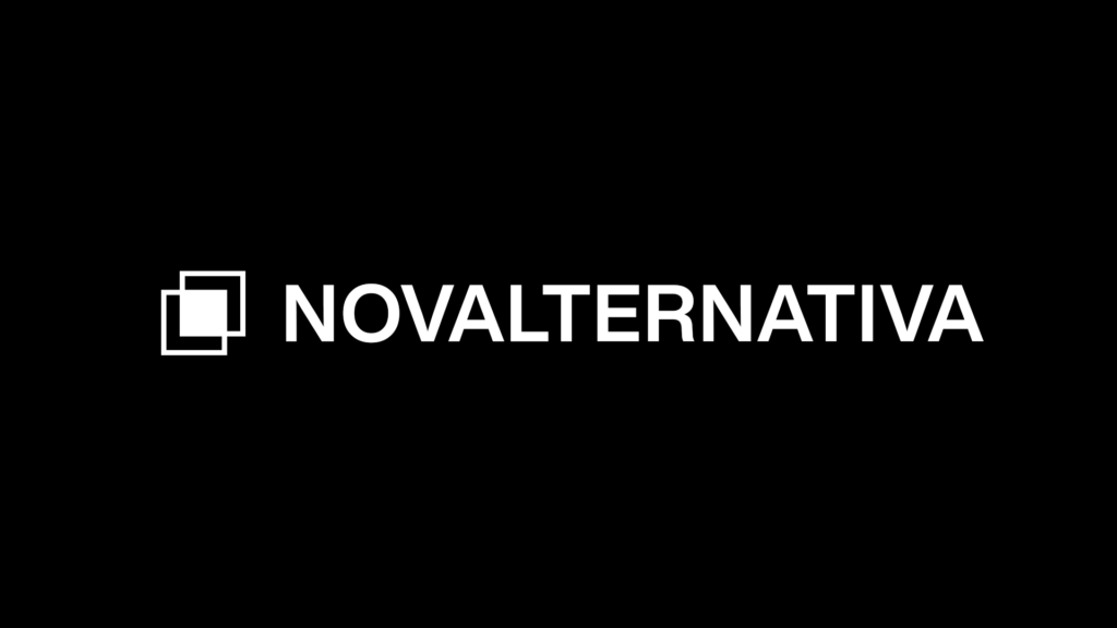
The logo
The logo for Novalternativa features two interlocking squares, symbolizing stability and connection, with a modern, minimalist design. Paired with clean typography and a professional color palette, the logo reflects the company’s commitment to building affordable, high-quality housing. The two squares represent both the structural integrity of their developments and the sense of community they foster, conveying Novalternativa’s mission to provide sustainable and accessible homes to Brazilian families.
The Colors
The logo for Novalternativa features orange, a color chosen for its warm and inviting qualities. Orange reflects the energy and optimism of the company’s mission to provide affordable housing, symbolizing growth and opportunity. This vibrant color captures Novalternativa’s commitment to building communities and improving the quality of life for Brazilian families, while conveying a sense of approachability and trust.
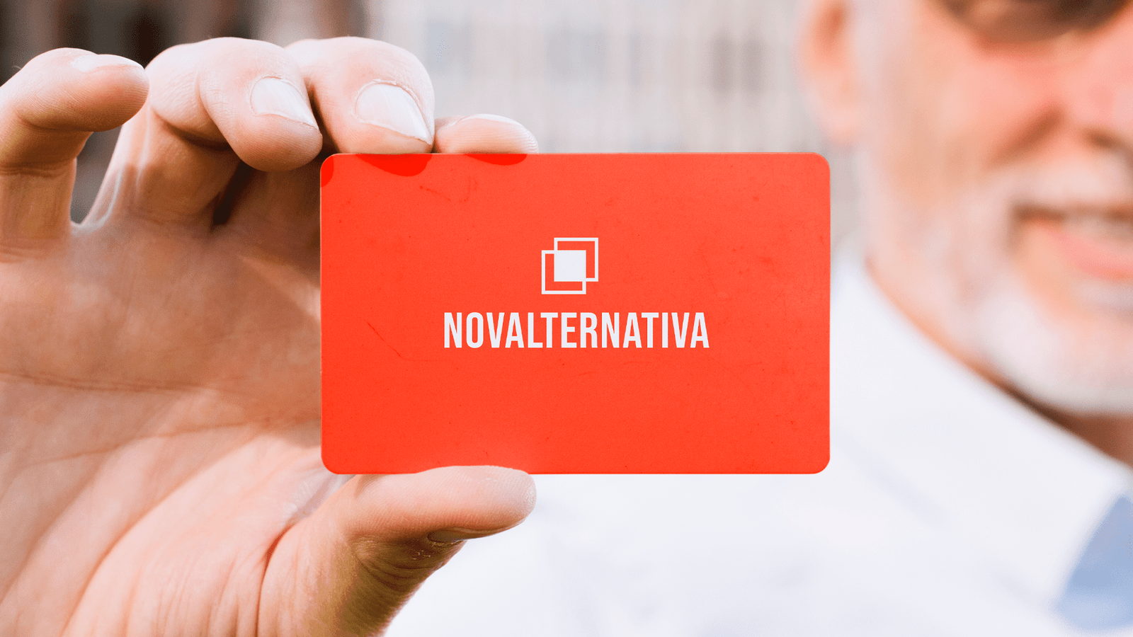
The Typeface
Capturing Strength and Reliability: The logo for Novalternativa was designed to convey the company’s stability and trustworthiness through the use of clean, geometric elements, while maintaining simplicity and clarity.
Appealing to a Broad Audience: The visual identity was crafted to resonate with a diverse audience, from first-time homeowners to seasoned real estate investors, ensuring broad appeal within the affordable housing market.
Reflecting Mission: The design reflects Novalternativa’s mission of providing accessible, high-quality housing, with the two interlocking squares symbolizing community connection and structural integrity.
Versatility: Using the Helvetica typeface, the logo maintains a sleek, modern aesthetic that works across various platforms and sizes, from digital presentations to building signage.
Results
The completed logo for Novalternativa effectively embodies the company’s commitment to affordable, high-quality housing. The bold orange color and clean, geometric design elements convey strength and optimism, making the logo approachable to a broad audience. Paired with the modern Helvetica typeface, the logo’s versatile design ensures it performs well across various media, from digital platforms to construction signage. This cohesive visual identity strengthens Novalternativa’s brand presence and communicates their mission to improve housing accessibility in Brazil effectively.
Client Feedback
Novalternativa was excited about their new logo design, appreciating how the bold orange color and the two interlocking squares capture the essence of stability and optimism. They felt the clean, modern look of the Helvetica typeface was a perfect fit, and they loved how the design works seamlessly across different platforms, from digital use to construction site signage. Overall, the company was very happy with how the logo reflects their mission of providing affordable, high-quality housing while fostering a sense of community.
Testimonial

