Malve Logo and Identity Design Project
Brand
Malve SEO
Category
SEO Agency
Year
2019
Team
Mateus Alves
Antenor Alves
The challenge
The client, an emerging SEO company, approached me to design a logo that would embody their core values of expertise and professionalism. Their mission is to help businesses improve their online visibility and achieve sustainable growth through cutting-edge SEO strategies. They wanted a logo that would reflect their technical expertise while also conveying trustworthiness and a forward-thinking approach.
Our resolution
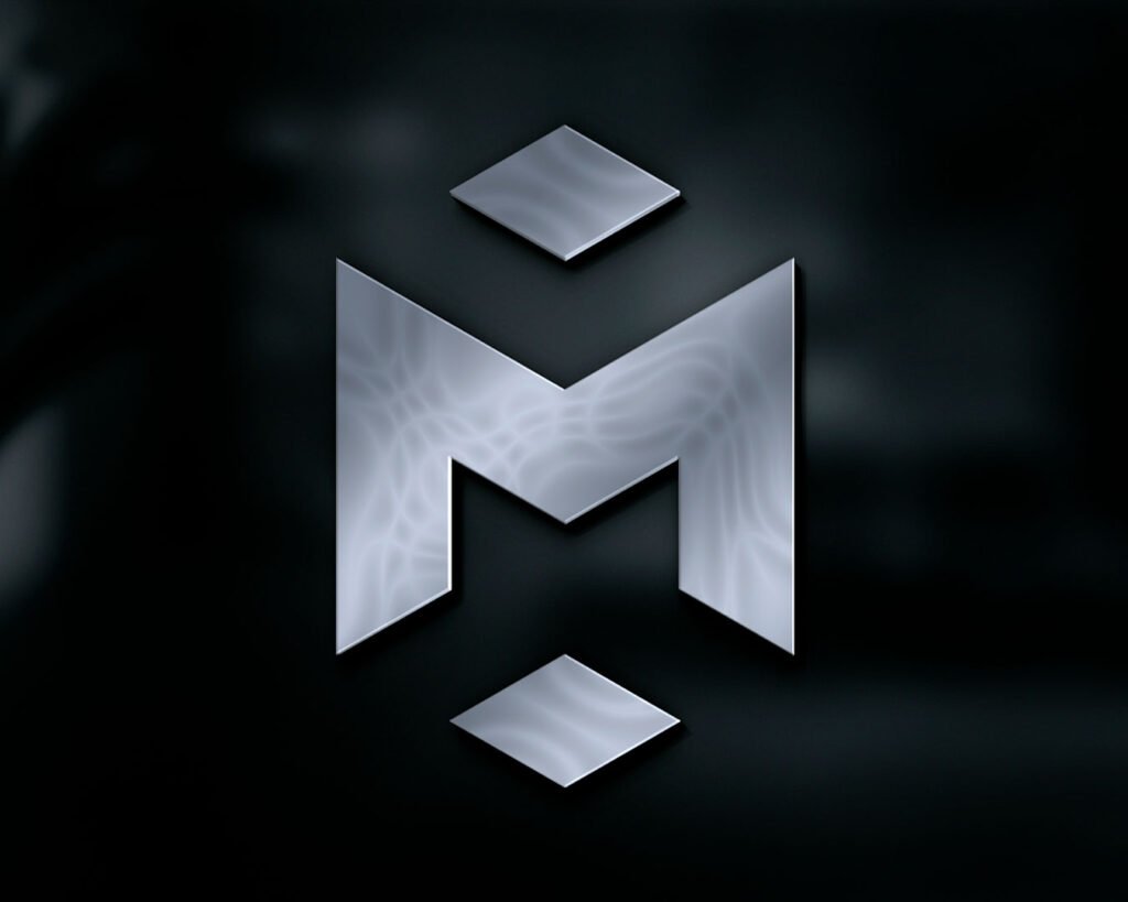
Through close collaboration and thorough research, we developed a brand positioning and visual identity that embodies the SEO company’s focus on expertise and professionalism. We transformed their static identity into a dynamic, minimalistic system, drawing inspiration from the precise and strategic nature of SEO itself. The clean and fluid design reflects their ability to adapt and grow, while the deep blue color palette communicates trust and stability, resonating with clients looking for reliable, forward-thinking solutions.
The logo
Simplicity: The final logo features a minimalistic design, incorporating a sleek, abstract icon that subtly represents growth and upward movement—key aspects of SEO success.
Color: The main color is a deep blue, chosen for its association with trust, stability, and expertise. The blue also ensures the logo stands out in both digital and print formats.
Typography: A modern sans-serif font was selected for the company name, complementing the icon and reinforcing the brand’s professional image.

The Colors
Blue was selected as the primary color for Malve’s identity. This color is widely associated with trust and reliability—two qualities crucial for an SEO agency. We explored different shades of blue, ultimately choosing a deep, rich tone that conveys depth and professionalism.

The Typeface
The final visual identity for Malve is a testament to simplicity and effectiveness. The logo is versatile, working well across various mediums, from digital platforms to print materials. The deep blue color reinforces Malve’s positioning as a trustworthy and professional SEO agency, while the clean design reflects their modern approach to digital marketing.


Challenges Faced During the Malve Project
1. Balancing Simplicity and Uniqueness: Creating a simple yet distinctive identity was challenging. We had to avoid a generic look while ensuring the design remained clean and impactful.
Solution: We introduced subtle, meaningful elements like an abstract icon that represents connectivity and growth, adding uniqueness without complicating the design.
2. Communicating Complex Services: SEO is complex, and translating this into a visual identity that was both accessible and resonant was difficult.
Solution: We used a deep blue color for trust and reliability, paired with modern typography and a subtle icon to convey the technical nature of SEO simply.
3. Achieving Client Alignment: Aligning the client’s vision with our creative process required close collaboration and frequent feedback.
Solution: We kept communication open, involving the Malve team in key stages, making iterative adjustments to ensure the final design matched their expectations.
4. Ensuring Versatility: The identity needed to work across various mediums without losing its impact or legibility.
Solution: We tested the design in different formats, refining elements to ensure consistency and clarity across all applications.


Results
The new logo successfully encapsulated the SEO company’s values of expertise and professionalism. It received positive feedback from both the client and their customers, helping to establish a strong brand identity in a competitive market. The minimalistic design and use of blue have become synonymous with the company’s reliability and cutting-edge approach to SEO, aiding in brand recognition and customer trust.
Client Feedback
The client was highly satisfied with the logo, stating that it perfectly reflected their brand’s ethos. The simplicity and professionalism of the design helped them stand out in the industry and effectively communicated their expertise to potential clients.
Testimonial

