10 types of logos and how to use them in your business
Logos play a crucial role in helping people recognize your company. A well-designed logo not only creates a strong first impression but also reinforces brand identity, making your business memorable and easily identifiable.
In this post, we’ll explore 10 different types of logos and offer insights on how to use them effectively to enhance your brand’s visibility and impact.
Whether you’re just starting out or looking to refresh your existing logo, understanding these types will help you make the best choice for your brand.
Table of Contents
What is a logo?
In simple terms, logos are symbols, made up of text and images combined. That help us identify brands and products in the market. A good logo will make the consumer buy a certain product, just as a bad logo can negatively affect the sales results of a brand.
Your logo helps the consumer understand what your brand’s language is, what feeling is involved behind it, what the prices of the products and services sold will be, and a bunch of other characteristics that will directly impact the perception of your brand by the consumer.
Such a small symbol can carry a very big responsibility, right? Therefore, the importance of creating a logo that reflects your brand’s ideal and its vision is essential for your business. In this post, we break down the types of logos and how to use each of them in your business. Ready to discover whats is the best logo design for your brand identity? Let’s go!
1. Monograms (or Lettermarks)
A monogram is a symbol made from the combination of two or more letters and other graphic elements like colors, shapes, and abstract designs. The word “monogram” comes from the Greek words “monos” (one, single) and “gamma” (letter). But today monograms can represent two or more characters. They are usually constructed by combining the initials of a company name, the owner’s name, or the names of loved ones.
The oldest recorded monogram dates back to Ancient Greece in 350 B.C., such as the letters alpha (A) and chi (X) for the city of Achaea, minted on coins from that location. Monograms served as symbols of origin and status, used by the wealthy and powerful to leave their mark.
Monograms have evolved over the years and are now used in various aspects of life, such as logos and brand marks. In the 16th century, people began demanding monograms to be embroidered on clothing and furniture as a way to demonstrate value and certify originality, according to this article from the University of Cambridge.
When to Use Monograms
Lettermarks or monograms can be used when your brand name is too big and can be easily forgotten. A monogram logo is easier to remember, as in the case of NASA (National Aeronautics and Space Administration) and IBM (International Business Machines). Monogram logo is an acronym, relatively easier to distribute and allocate in the different formats. For a new company that wants to start its activities quickly, a logo in monogram format will help a lot.
You can choose to write the full name of your brand right below the acronyms of your logo, as is the case by Louis Vuitton. That can help costumers remember the full name of your brand in the future.
Famous Examples of Monograms


2.Wordmarks (or Logotypes)
Wordmark uses the name of the brand, product or company as the main element of the logo. These are logos with a minimalist design that use unique and personalized fonts, designed for the brand’s specific use. This design makes it easier to read and remember brand’s name and clearly communicates it.
Also known as Logotype, this logo is popular and used by many globally known brands, from the food industry to the technology industry. Surely you remembered some brands and associated them with each branch. This is the power of the wordmark logo, creating brands that are difficult to forget.
Some brands, like Coca-Cola, have created such strong logos using unique fonts that if used to write any other text, consumers would remember the brands linked to the fonts immediately.
When to Use Wordmarks
If your brand has a short and, above all, catchy name, it will enjoy a Wordmark logo. Combine this with a unique font, designed for your brand and you will have a powerful and memorable name. This way, you can penetrate consumers’ subconscious and be remarkable in your market.
Famous Examples of Wordmarks


Lettermarks or monograms can be used when your brand name is too big and can be easily forgotten. A monogram logo is easier to remember, as in the case of NASA (National Aeronautics and Space Administration) and IBM (International Business Machines). Monogram logo is an acronym, relatively easier to distribute and allocate in the different formats. For a new company that wants to start its activities quickly, a logo in monogram format will help a lot.
You can choose to write the full name of your brand right below the acronyms of your logo, as is the case by Louis Vuitton. That can help costumers remember the full name of your brand in the future.
3. Pictorial Marks (or Logo Symbols)
Pictorial mark, known as logo symbol or brand mark, is the symbol that can identify your brand, without depending on any name or other information. It can be very detailed or follow current minimalist fashion, it is generally made of real elements that are easy for consumers to identify. The logo symbol summarizes your brand’s values and what it represents.
Choosing a symbol for your brand requires deep thought and is one of the most important choices to position it well in the market. The Pictorial mark must be able to integrate with the brand, making a connection with its name. This way, it can be used alone in any context and will be recognized as part of your brand.
A logo symbol without connection to the brand name can generate such mental confusion that it will transform your brand into a forgettable unknown or a simple joke that should not be taken seriously.
When to Use Pictorial Marks
They can be used by brands that have achieved or aim to achieve global relevance, facilitating brand communication in all languages in a universal way. A symbol can be printed everywhere and formatted to fit any medium by simplifying complex names and ideas into a single symbol.
Famous Examples of Pictorial Marks

4. Abstract Logo Marks
Abstract logo marks are symbols that do not represent anything in the real world, but represent the entire feeling and vision of your brand. Take the Pictorial Mark concept and think of a symbol for your brand. Now think deeper. Now in more depth again. Keep thinking deeply until you reach the most intense meaning of your brand and everything it wants to show the world.
An abstract symbol is not tied to the limits of the real world and through fluid shapes and bright colors demonstrates the values of your brand in a unique way, connecting with the consumer’s subconscious without saying a single word.
When to Use Abstract Logos
If your brand is disruptive and wants to show the world new possibilities or offers a range of services and products, an abstract logo can demonstrate your ideals very well, as well as being an excellent tool for transmitting your brand’s central message globally, as well as the traditional logo symbol.
Famous Examples of Abstract Logos

5. Mascots
Mascots logos are real or fantasy characters that represent your brand. They can be humans, animals or even objects that relate to what your brand is selling. A mascot is your brand ambassador, the face that represents all the values of what the brand believes in.
They are usually portrayed in a cartoonish way and connect more with children or family, as humans tend to connect with other humans or humanoid characters.
When to Use Mascot Logos
You should certainly use mascots in children’s brands or brands that want to appeal to families. These figures are easy to use in animations, comics and other ways of telling a story, making them ideal for those who want to build interactivity with the brand and generate connections. A mascot will be your brand’s spokesperson and will be the one who communicates what your brand wants to convey.
Famous Examples of Mascots


6. Combination Marks
Combination marks are self-explanatory logos that combine text with symbols. Perhaps they are the most conventional logos that all brands in the world use. They are versatile and can be formed through any combination, such as: a letter with a symbol or a mascot with a letter.
It is possible to create infinite different logos for the same brand just by combining different elements. You can create variants and use each of them in different scenarios.
When to Use Combination Marks
You can use Combination Mark anywhere your brand appears. Combining two elements such as a symbol and a word makes consumers assimilate both as one, contributing to the brand’s branding and allowing these elements to be explored separately in the future, without the meaning of each one being different.
Famous Examples of Combination Marks
7. Emblem Logos
Emblem logo is a logo that combines texts and graphic elements within a symbol or icon. A logo in this format resembles royal house coats of arms, emblem logos are common in universities, government institutions and soccer teams. These logos have a traditional and classic appearance that help convey a certain sense of importance and tradition.
Brands with this logo can convey seriousness and traditionalism, leading consumers to believe that this brand has a long history in the market. Printing Emblem logos can be more difficult on different types of material, as they have many elements and the background colors must always connect with the elements of the logo.
When to Use Emblem Logos
If your brand wants to show that it has tradition, that it inspires trust and authority, an emblem-shaped logo is a great option. Brands that use Emblem logos demonstrate long-standing cultural heritage and values, it is a great option for brands that seek to convey belonging to the world of elites.
Famous Examples of Emblems


8. Dynamic Marks
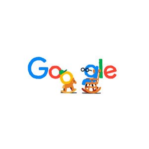
Dynamic Marks are logos that change their appearance all the time, but maintain the central element, usually the name, so that your brand is easily recognized. These are more modern logos that have emerged in recent years, giving brands flexibility and adaptability.
They help convey the feeling of innovation, bringing change and movement to your brand.
Google uses this strategy when it wants to pay homage to an important historical figure or highlight a special date, modifying its logo with elements that refer to the person being honored at the time.
When to Use Dynamic Marks
A Dynamic Mark helps your brand position itself on different products and adapt to new forms of advertising, changing small elements, generating prominence for your brand in environments that may be saturated.
If your brand has a range of different products, using a Dynamic Logo for each of them is a strategy that can be used.
Famous Examples of Dynamic Marks
9. Animated Logos
Animated logos are dynamic logos with a much greater degree of mutation. They can take liquid, solid, gaseous forms or any other form that imagination and animation programs can make. They use motion graphics techniques to take on different forms and impact consumers with dynamism.
When to Use Animated Logos
If your brand is directly involved in the transmission of digital content, such as video, films and animations, an Animated Logo is a very fun element to use. The audience will always be eager to see what has been planned for your brand’s logo this time, which can generate discussions and great repercussions around this small, but dynamic and surprising logo.
Famous Examples of Animated Logos
10. Letterforms
Letterforms are minimalist logos, the ultimate abbreviation for Lettermark logos. Letterform logos use just one letter, usually the initial of your brand name. Simple and direct, they can impact the consumer and quickly occupy a space in their subconscious.
Using a letterform logo to represent your brand requires careful design. Although simple, this logo will be the first representation of your brand and will be its identification symbol. You can use intense colors and bold design to attract attention and differentiate yourself in the market.
Some brands choose to create a larger logo, in the Lettermark format and then adopt a Letterform logo to facilitate printing and brand recognition in different formats.
When to Use Letterforms
If your brand advocates minimalism or likes to position itself that way, use a Letterfom logo. It’s no secret that these logos are simpler, which is advantageous for minimalist brands. In addition to being an excellent option for brands with very long names that are difficult to remember.
If your brand is undergoing a rebranding, that is, a total redesign, opting for a logo in this format could be the change your brand needs.
Famous Examples of Letterforms


Types of Logos FAQ
Why Are There So Many Types of Logos?
There are different types of logos because there are different types of brands. And there are many types of brands. Each of these brands wants to convey different values and want to impact the right consumer, who connects with the brand. The logo represents many aspects of the brand in a direct and objective way and each brand needs to differentiate itself and transmit its values.
Why Are There So Many Types of Logos?
Monograms or Lettermark logos are the most common choice, along with Wordmarks. These are direct logos that display the brand name. This is the best way to spread your brand’s name and penetrate the consumer’s imagination.
Which Combination of Logos Does My Brand Need?
This will depend on many factors, but to make it easier, you can base yourself on this guide:
Short, Catchy Name:
Wordmark or Lettermark: If your brand name is short and easy to remember, a wordmark (a logo made entirely of your brand’s name) or a lettermark (using initials) can be effective. These types of logos emphasize your brand name and are often clean and straightforward.
Long or Complicated Name:
Pictorial Mark or Abstract Mark: If your brand name is lengthy or complex, consider using a pictorial mark (a logo using a recognizable symbol) or an abstract mark (a logo using a unique, non-representational symbol). These logos help simplify your branding and make it more memorable.
Visually Appealing and Memorable:
Pictorial Mark or Abstract Mark: These types of logos are visually distinct and can leave a lasting impression on your audience. They are ideal for creating a strong visual identity that resonates with your brand’s message.
Unique and Distinctive:
Abstract Mark: If you want a logo that stands out from the competition, an abstract mark can be a great choice. Its uniqueness helps create a distinct brand identity that’s instantly recognizable.Fun and Friendly:
Mascot Logo: A mascot logo uses a character to represent your brand. This type of logo is perfect for creating a friendly, approachable image, especially if your brand targets a younger or more casual audience.
Visually Appealing and Easy to Understand:
Combination Mark: A combination mark uses both text and a symbol or icon, making it versatile and easy to recognize. It combines the strengths of wordmarks and pictorial/abstract marks, making it a comprehensive solution for branding.
How to Choose the Right Colors for My Logo?
Choosing the colors for your logo is very important, the meaning of the colors can help you choose the colors that best demonstrate your brand’s values and vision.
Each color demonstrates a different meaning and connects in a different way with the consumer’s thoughts.
What Is the Importance of Typography in Logo Design?
In addition to readability, typography will also directly impact what your brand wants to convey. A serif font can convey an air of traditionality and seriousness, while a sans serif font can convey modernity.
Conclusion
Now you know everything about logo types and when to use each format. Your logo is the first contact that consumers will have with your brand and through your logo, the consumer’s imagination will be touched in a different way. You need to think very carefully about what image you want to convey and what you want to subcommunicate through your logo. A well-designed logo will facilitate communication, just as a poorly designed logo can hinder the perception of your brand. Hiring a professional logo creation service is what the biggest brands in the world have done to obtain an iconic logo and increase their company’s revenue.
Article Sources
Are you Looking for a Professional Logo Designer? Contact us
If you’re looking for a design agency that creates simple, iconic, and memorable visual identities, Nova Chicago is here to help. Let’s work together to craft a design strategy that attracts high-paying clients and sets your brand apart. Contact us today to start your journey toward unforgettable design.
Contact Us:
Nova Chicago is an Agency that helps businesses and personal brands attract high-paying clients through design and strategy.
Quick Links
Get In Touch
- Email: Contact@novachicago.design
- Phone: +55 (84) 99854 3058
- Hours: Mon-Fri 9:00AM - 5:00PM
